

Sandisk Memory Zone
user interface design | graphic design
Overview
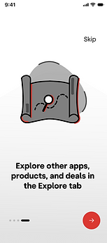
data storage app onboarding screen design
Product:
graphic design, interface design, design system development
My Role:
onboarding screens design in Figma
Designed in:
July 2023

Overview – The Problem
The Sandisk Memory Zone app was originally out of touch with current design trends. With concerns of hardware data storage like memory cards, flash drives, etc already becoming more and more obsolete with the risk of cloud storage, the app needed to welcome users in a warm way that felt more modern.

Ideation
Unlike many other UX design projects I've worked on, the Sandisk Memory Zone (SMZ) app was unique because it operated within a rigid preexisting design system. The fonts, color palette, and more were already a part of a larger Sandisk brand identity. As such, this app decision served more as an opportunity to work creatively within set constraints, and I found myself experimenting with gradients, opacity levels, and illustrations to effectively convey the different use cases for the app within a welcoming introduction screen. With limited prior background in illustration, I focused more on the graphic design elements of the onboarding screens with a focus on designing in ways that exuded playfulness and approachability. I identified these two traits as the most important as flash storage backup already has so many barriers to entry compared to cloud storage. In order to widen the potential customer base, it made most sense to cater the app design to people who may be interested in flash storage options as opposed to things like ICloud, but were afraid to pivot or didn't know how. This wouldn't alienate the preexisting consumer base that were more technologically-minded, while allowing for a new user persona to be able to use the app.

Design System
Colors
Typography
font: Common Sans
Components
monochrome grey gradients with reduced opacity at the end
The app's color palette was in line with that of the Sandisk brand identity. Blue was added as a primary color with the same saturation level as to complement Sandisk's distinct red. This was done to avoid a completely monochromatic app, as introducing more color would align with the app's playful feel. I chose to limit this to two colors in order to best parallel the rest of the Sandisk ecosystem.
Sandisk's brand guidelines state that associated typography should be done in Common Sans. This was an easy choice.
Sandisk exists within the larger Western Digital ecosystem. In the app, I wanted to create some sort of nod to Western Digital's brand identity. I chose to do so via gradients. Western Digital's Style Guide discusses its use of gradients comprehensively. While they're normally done in Western Digital's blue-purple-pink color scheme, I was able to pull some Western Digital greys as well as opacity/transparency suggestions in a few of the intermediary background elements. This was done with prioritizing subtlety, and was not meant to have equal weight to the brand identity of Sandisk.


Final Design


Other Iterations


